Splitwise
2024
[01.0]
A software solution tailored for seamless bill-splitting experiences among friends and family.
[01.1]
Project Brief
Splitwise consolidates collective expenditures into a singular hub, allowing users to effortlessly track their shared expenses and IOUs in one place.
Managing a cloud-based platform ensuring universal data accessibility, seamlessly bridging across devices such as iPhones, Androids, and personal computers.
Role
Product Designer
Team
Alberto Lozano
Mark Schubert
Timeline
12 weeks
Tools
Figma & Figjam
Dovetail
Maze
[01.2]
The problem
and the goal.
In today's tech-savvy world where young professionals often live communally, there's a need for an app that fosters financial harmony, a role Splitwise aims to fill. However, its outdated and confusing UI, reduces user adoption and retention.
Our goal is to improve Splitwise's user experience in expense categorization and payment tracking to boost adoption. We aim to build trust and accountability among users.
[02.0]
User Research
Identifying our challenges through research
As a team we undertook different approaches to further understand the shortcomings currently within the app. Through strategies such as user surveys and usability reviews, we gained invaluable insights into tangible issues, substantiated by data-driven observations.
[02.1]
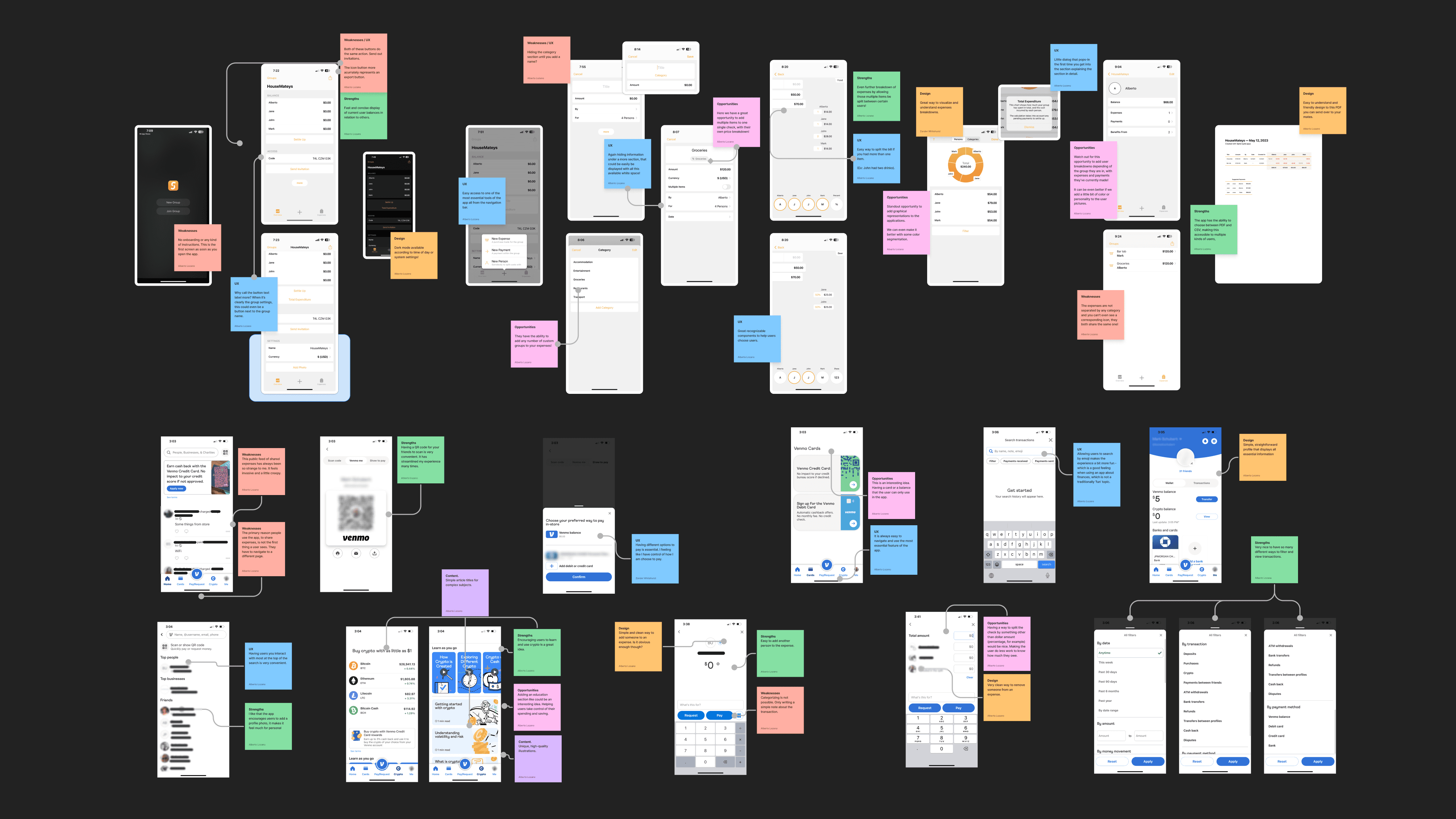
Competitor Analysis
We performed a benchmarking analysis on both an indirect and a direct competitor to gain insights into industry trends and identify UX and UI patterns. This enabled us to identify the strengths and weaknesses that the app was currently experiencing.
[02.2]
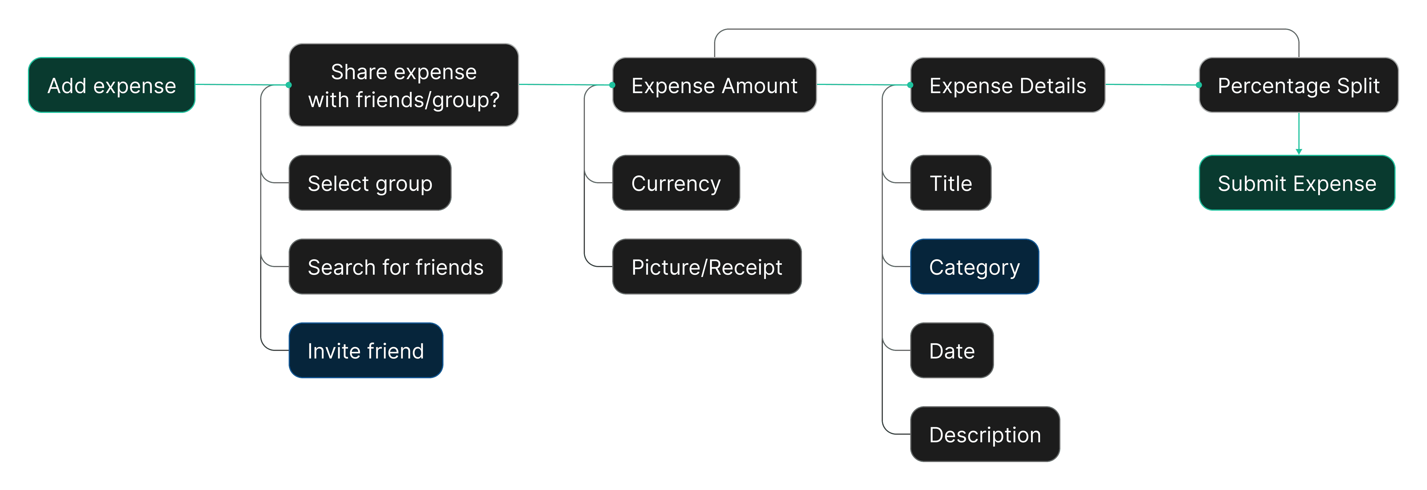
Making the expense tracking flow
more intuitive
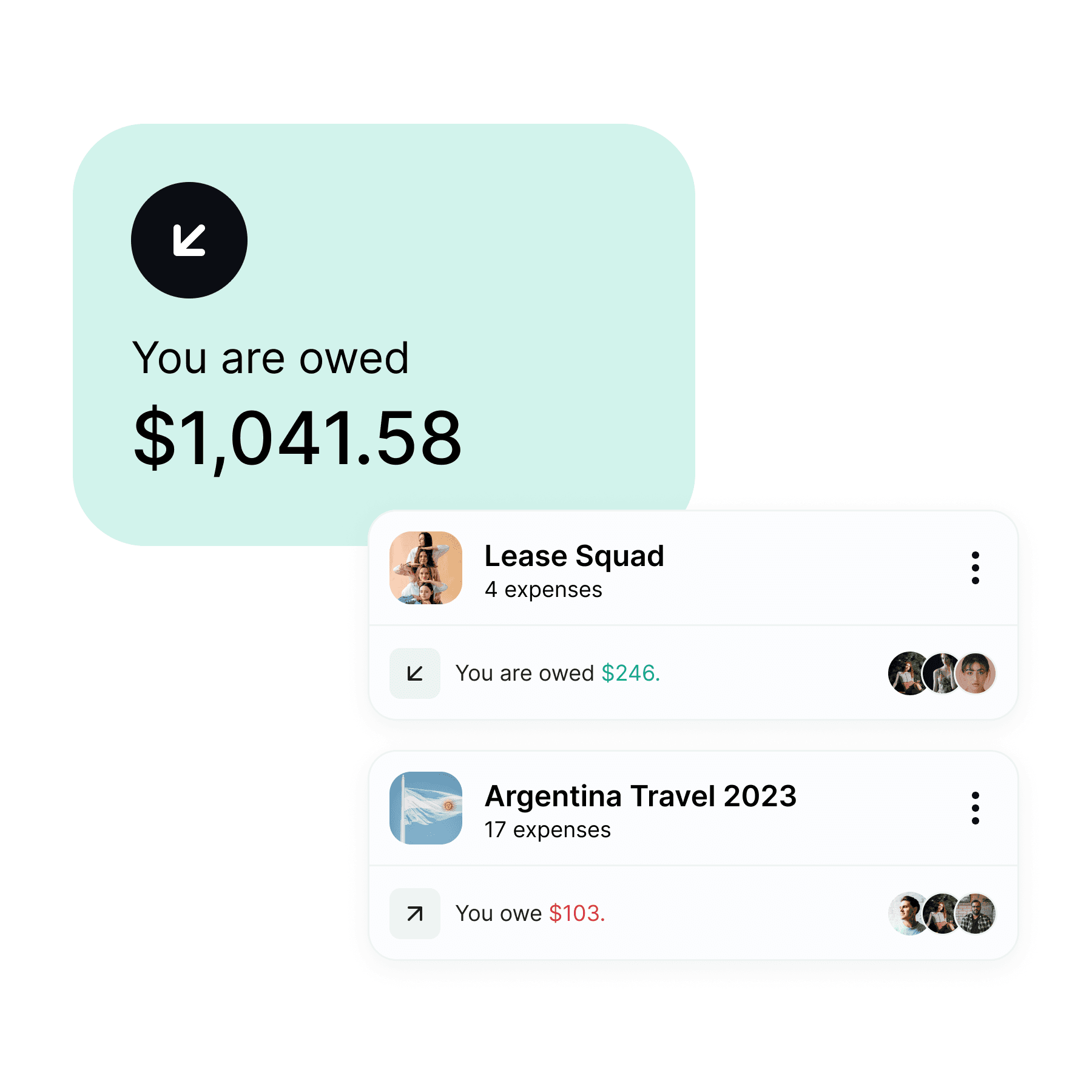
Based on the data we had collected previously, the team made the decision to prioritize addressing a significant issue that users were encountering with the application, specifically related to the "Adding & Tracking Expenses" feature.
The existing process was cumbersome and lacked essential customization options, resulting in a decline in user engagement.
[03.0]
Design System & Hi-Fi
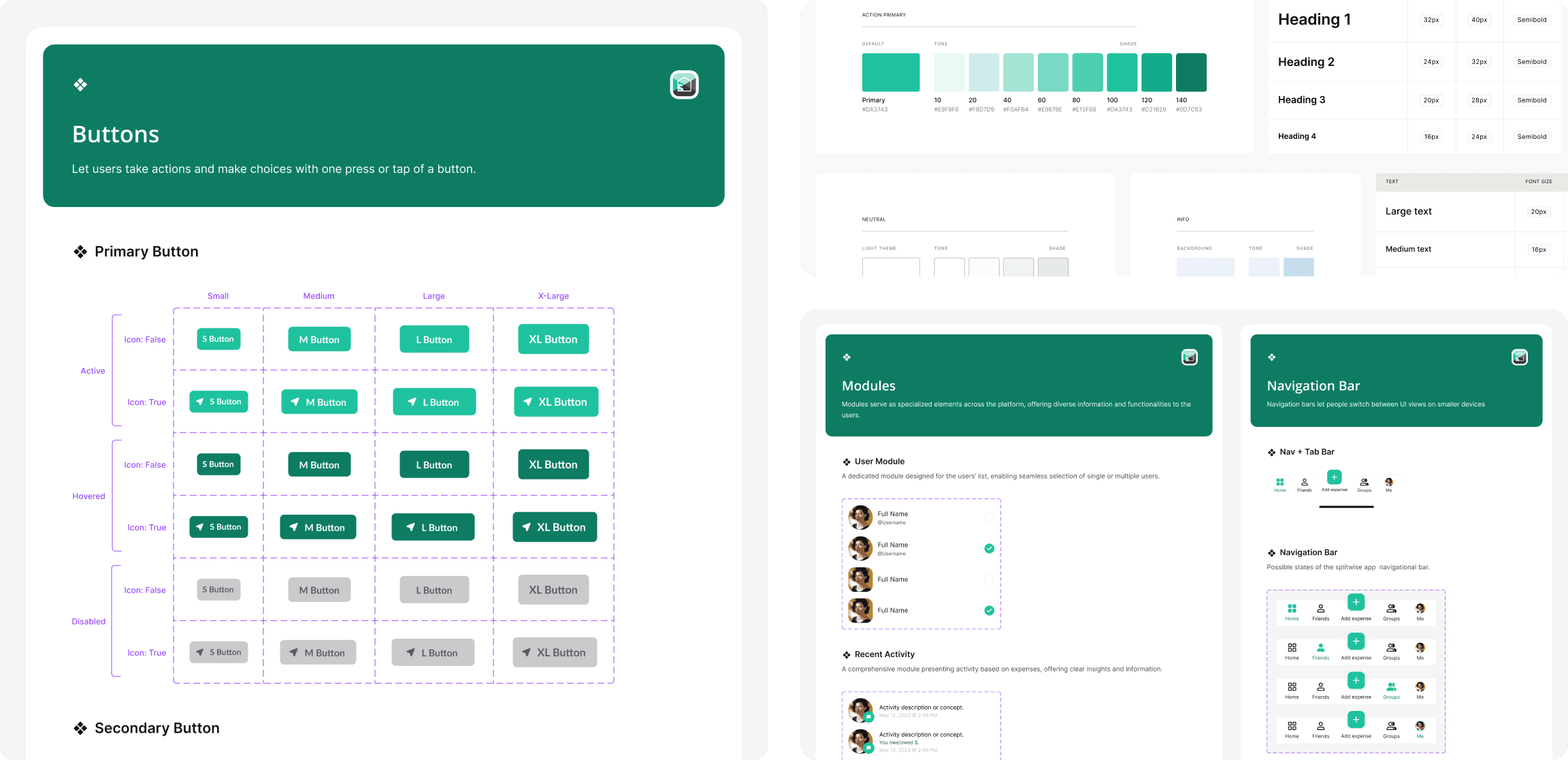
Designing consistency, redefining accessibility
We addressed the long-overdue redesign of the application interface, driven by the necessity for consistent and accessible design standards within the application. To establish this uniformity, we developed a robust Design System as the core framework for the app. Our design principles were grounded in the 'Atomic Design' methodology,
This allowed us to create a clear hierarchy and relationships between components, elements, and patterns. Ensuring inclusivity, we meticulously adhered to WCAG standards and guidelines, applying them to everything from text styles to color choices, thus making our application accessible to a broad user base.
[03.2]
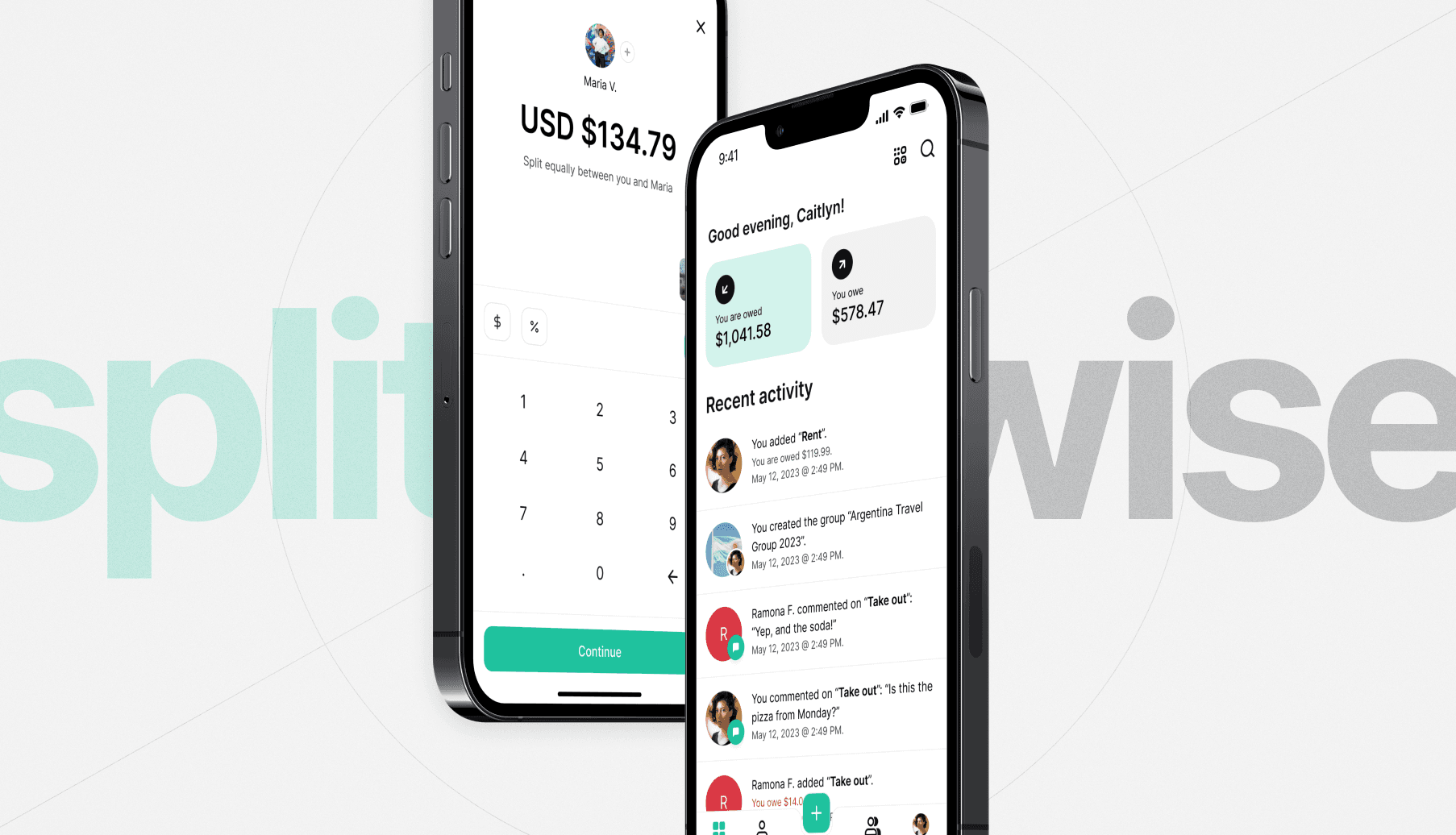
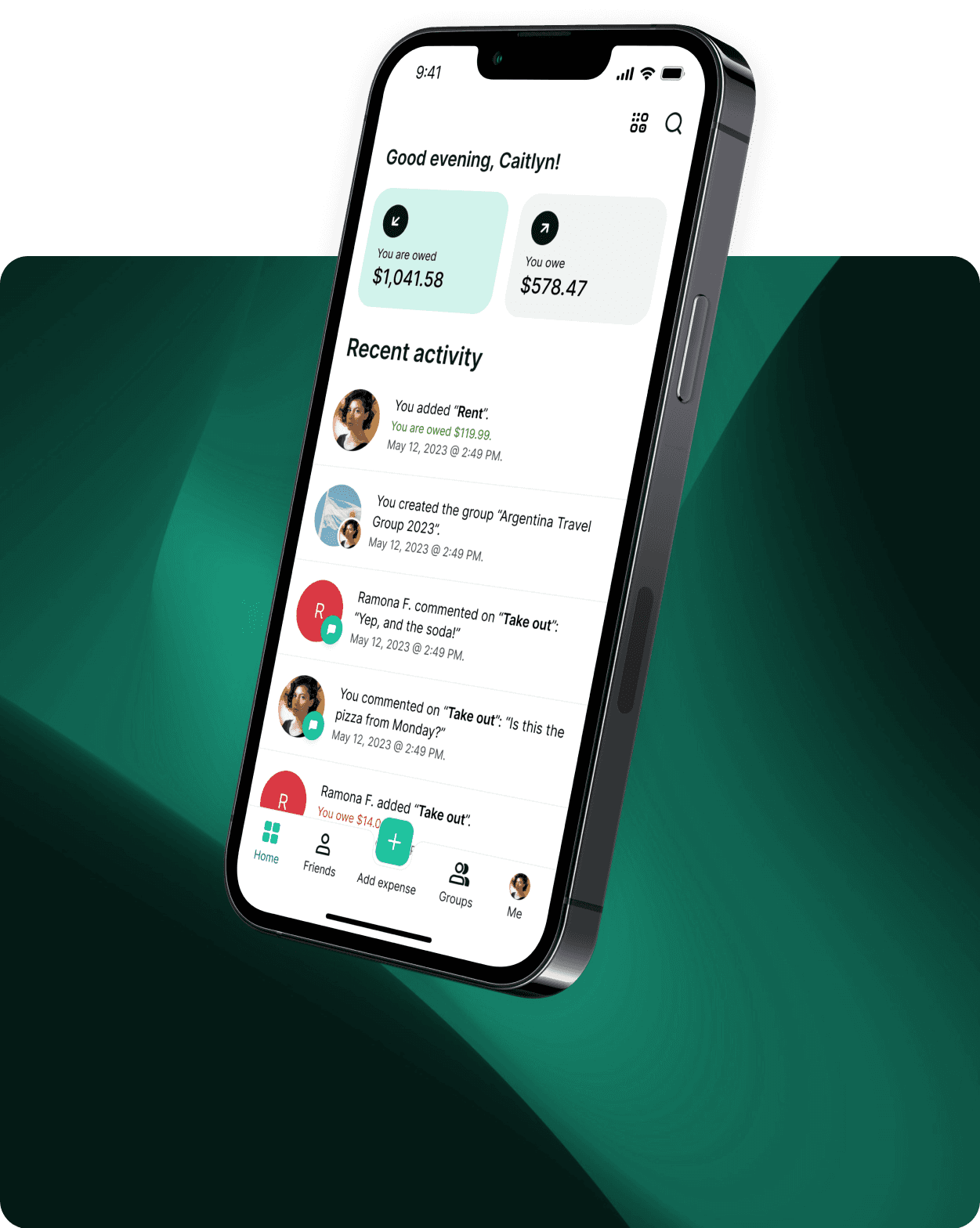
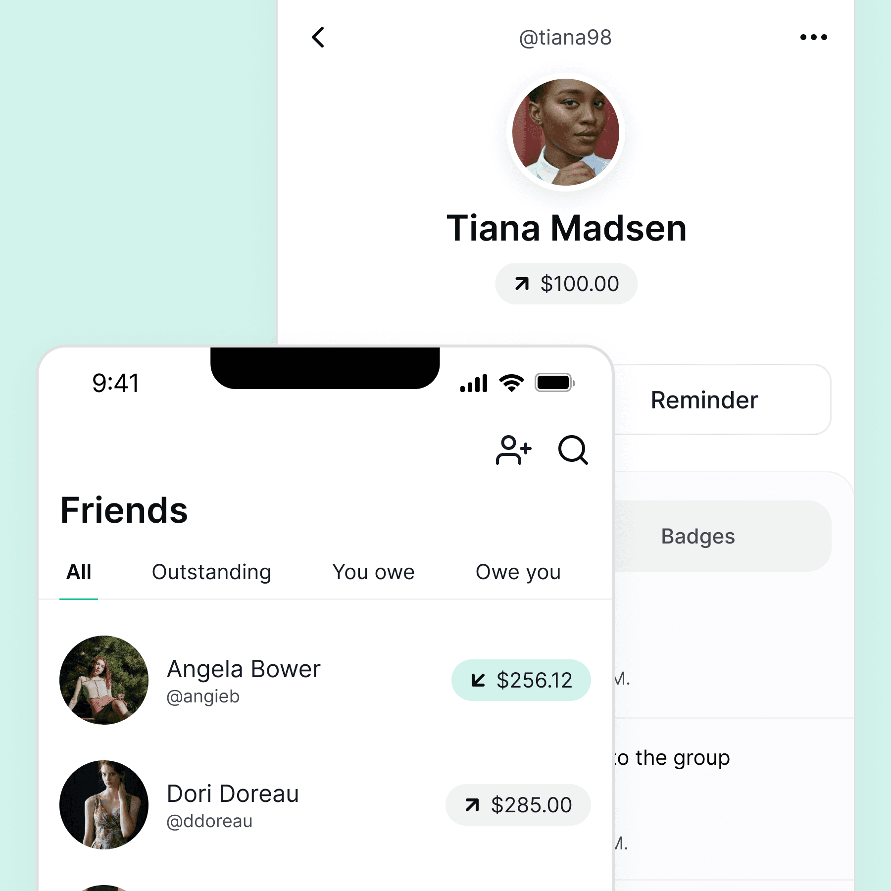
Re-building the Splitwise platform
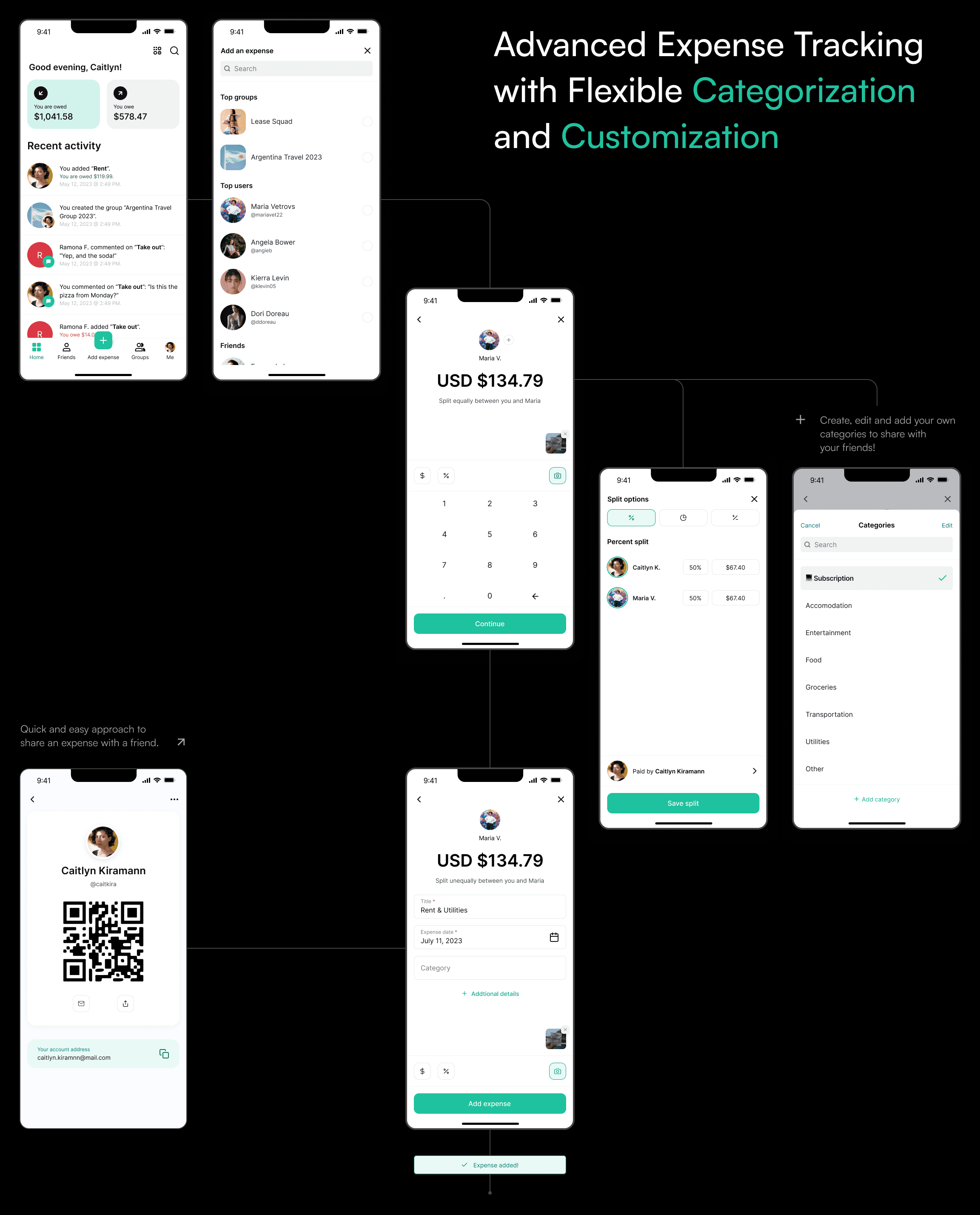
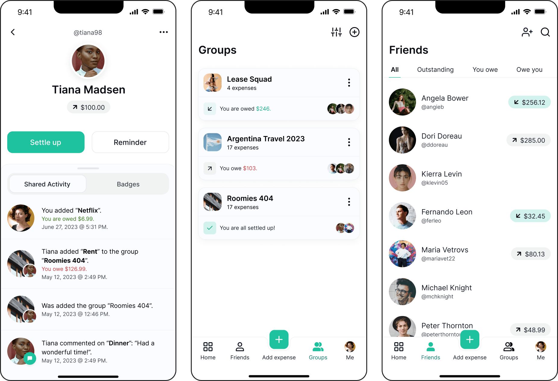
After establishing our foundational building blocks, we proceeded to craft high-fidelity screens incorporating our new components and variants. We meticulously designed a series of user flows in alignment with the product requirements, forming the basis for creating a prototype to undergo user testing.
[04.0]
Usability Testing
Refining the Flow with our Users Feedback
Having solidified our design, we moved forward with the development of a prototype, aiming to replicate essential user interactions for three key functions:
01
Create, add, and modify existing or new expenses with friends or groups.
02
Integrating innovative tools that allow the user new options to split expenses.
03
Integrate the ability to add and create custom categories for each household.
(04.1)
This prototype served as the foundation for an unmoderated usability test for Splitwise users, facilitated through Maze.co. The testing script encompassed the three scenarios mentioned above, presenting users with various tasks to complete."
[04.2]
Insights and iterations from testing
The outcomes of the unmoderated usability tests were encouraging, boasting a high completion rate along the expected user path. Nevertheless, the testing process also shed light on specific areas of the app that could benefit from additional fine-tuning.
In response to these findings, we implemented minor quality-of-life (QOL) enhancements aimed at improving the user experience, particularly in areas related to system status and feedback.
[05.0]
Key Learnings
Designing consistency, redefining accessibility
1.
Understanding your user base is vital for creating a user-friendly app, especially for those unfamiliar with it. What may seem intuitive to you could be confusing for others. User feedback plays a crucial role in gauging how real users perceive changes made to the app.
2.
Visualizing your ideas can greatly aid the ideation phase of design, particularly in our increasingly digital world where remote work is common. This visual approach is valuable when conveying concepts to team members who may not be well-versed in UX/UI terminology, such as stakeholders and developers.
3.
Understanding your user base is vital for creating a user-friendly app, especially for those unfamiliar with it. What may seem intuitive to you could be confusing for others. User feedback plays a crucial role in gauging how real users perceive changes made to the app.
[05.1]
Next Steps
The outcomes of the unmoderated usability tests were encouraging, boasting a high completion rate along the expected user path. Nevertheless, the testing process also shed light on specific areas of the app that could benefit from additional fine-tuning.
In response to these findings, we implemented minor quality-of-life (QOL) enhancements aimed at improving the user experience, particularly in areas related to system status and feedback.